Designing human-centered digital experiences to help you gain quick insights with Quid
Project Summary
I worked at Quid, a SaaS data visualization platform, for just over three years. Initially brought in as the sole, full-time designer to stretch between serving the technology and marketing teams, I eventually shifted my focus towards the data viz platform, transitioning into ux design and helping build out the design team to four.
I was responsible for leading a number of large initiatives all aimed at creating easier, more efficient pathways for our users to gain insights from our tool. Each project often spanned months, containing a series of more specific feature improvements requiring extensive user experience research, cross-functional planning, iterative progress, and stakeholder approvals. My work was often if not always in collaboration with our Data Science, Engineering and Client Services teams.
These are a few of the most impactful projects I worked on while at Quid.
Services
User Experience
User Interface
Data Visualization
Information Architecture
Visual Design
My Role
Senior User Experience Designer
Of Note
I’m a co-inventor on four design patents from my work at Quid.
One | Cluster Labels
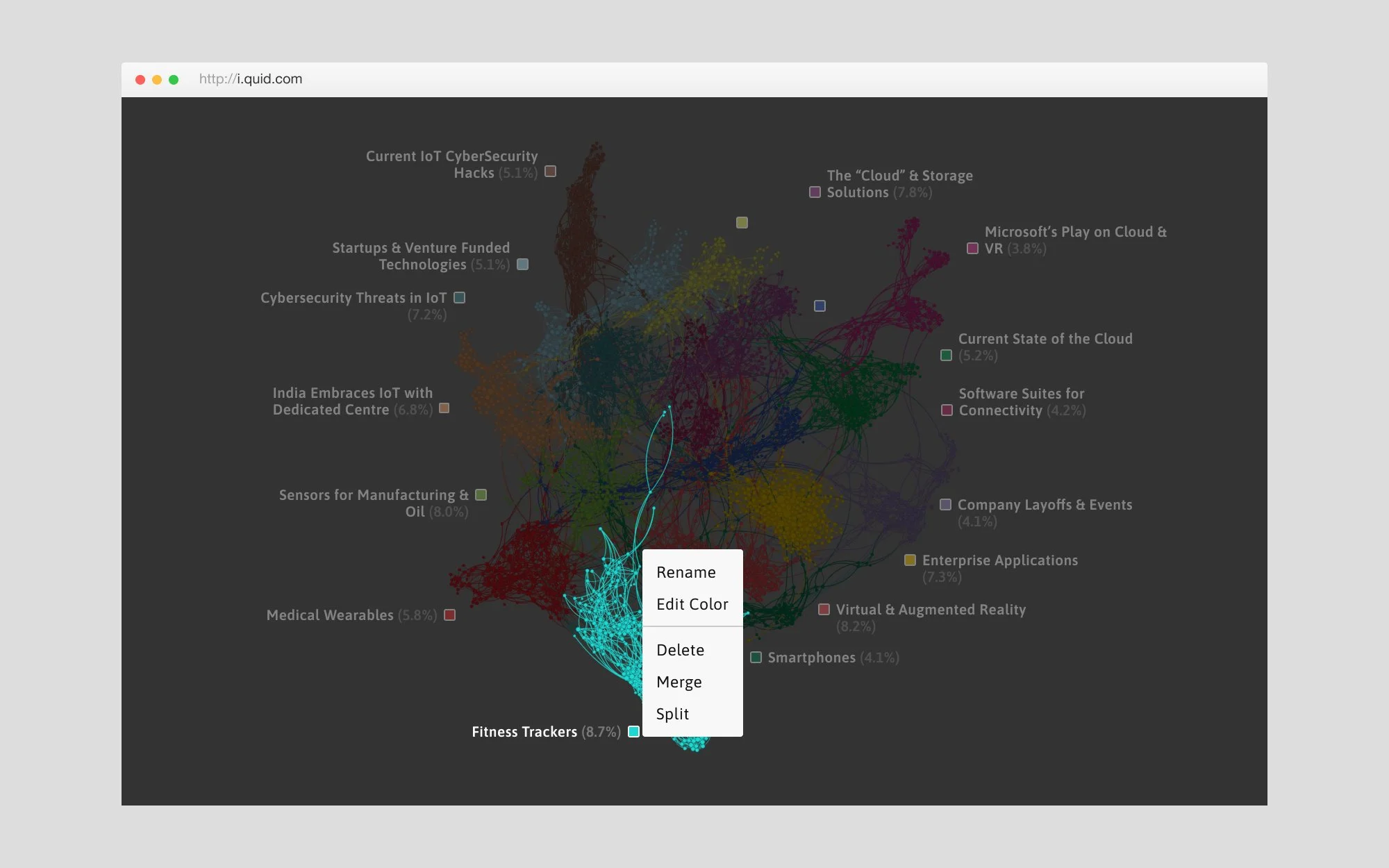
Cluster Label Positioning & Cluster Anchors
Clusters, or categories, are groups of similar nodes (the dots) distinguishable within the graph by their shape, color and name. They represent the major themes of a network, and are a critical component of the tool for users. Our original cluster positioning algorithm made the labels difficult to comprehend while working in the tool, and generally required users to manually recreate the labels in their reports.
The new label placement may seem like a simple change, but working with unknown data and live visualizations presents a huge challenge when trying to create user experience solutions. You never get to design for the best case scenario. Luckily, I was working with some really talented people, and we developed a novel technology that used regions and a kind of magnetic force to define where a label was positioned in relation to a cluster.
I also developed a concept to further alleviate some pain points our users had working with clusters in the tool called “cluster anchors”. These cluster anchors allowed users to more easily take common actions that were difficult and obscure to do previously.
Cluster label positioning was one of my projects that led to a design patent.
Two | Information Panel
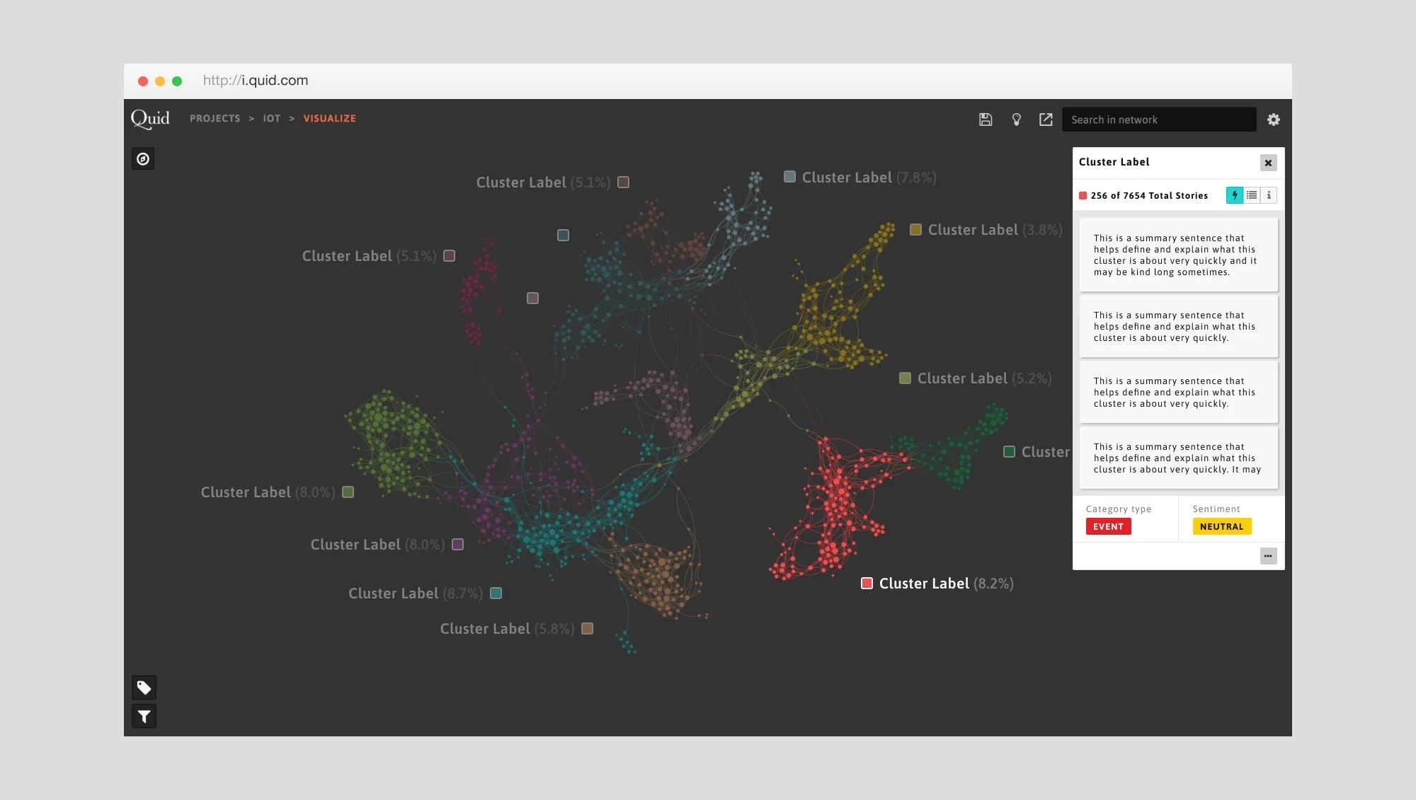
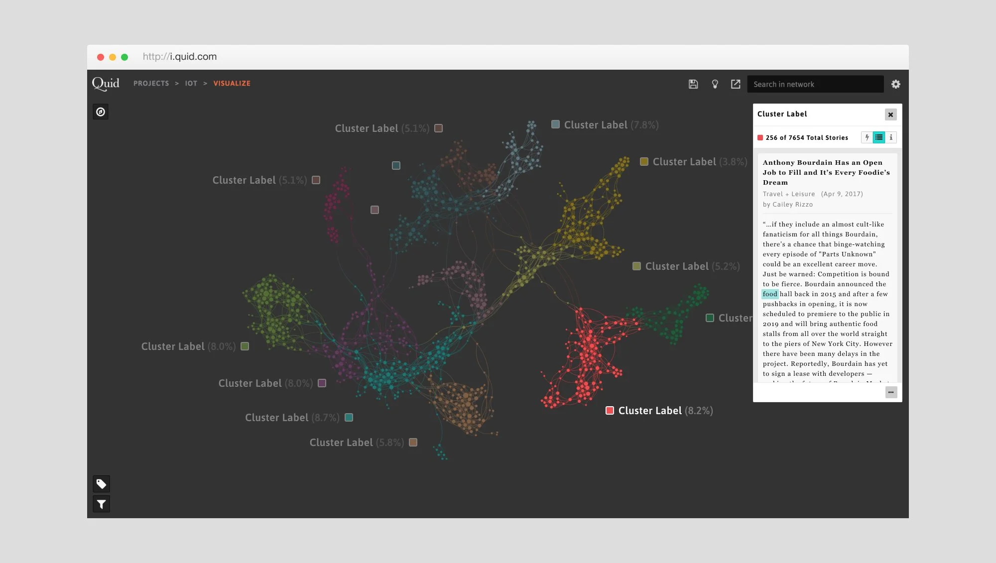
The new info panel starts collapsed, keeping focus on the visualization. Once opened, the panel shows featured metadata information our users indicated most useful. Once a cluster is selected, the info panel shows cluster highlights (a new feature), or a user can toggle to switch between available types of data or meta data to explore further.
Solving Info Panel Pain Points
Like most things that I worked on within the Quid platform, the info panel was a vital feature to gaining insights from the tool, and really difficult to work with. As you can see from the image of the original design, the info panel was buried within a visually cluttered screen, had tiny UI elements making comprehension and interaction difficult, and had no clear priority of information. Being a massive pain point for our users and internal client services team, this became a very high stakes project for me.
It’s difficult to demonstrate the totality of work that went into this project, and the degree of available information and actions a user could take within the updated panel, but I think even these few images show what a difference I was able to make in legibility, hierarchy, and prioritization of information. This was very much like most of my projects at Quid - time consuming, mentally fatiguing, and insanely complex with an outcome that (ideally) looks pretty dang straight forward.
Three | “Mere Mortals”
Reimagining The End-to-End User Experience
There were a few “pie in the sky” projects I worked on while at Quid that ultimately led to very real and impactful product improvements. Projects like this one introduced ideas that eventually led to more specific, tangible feature improvements we were able to implement with extensive user research, iterative, cross-functional progress, and at times completely novel solutions. Some of the work on this project can be tracked to at least 2 of my design patents with Quid.
Ultimately, and most importantly, all of this work was aimed at understanding what our users were trying to accomplish, being extremely sensitive to their behaviors, backgrounds and instincts while working with live data, and developing systems that allowed them to accomplish their goals as easily as possible while maintaining the power of the tool.
This particular project was dubbed “Mere Mortals” in that vein, to treat our users like mortals, while attempting to give them superhuman capabilities.
Four | Pattern Library
Developing Systems to Save Time and Money
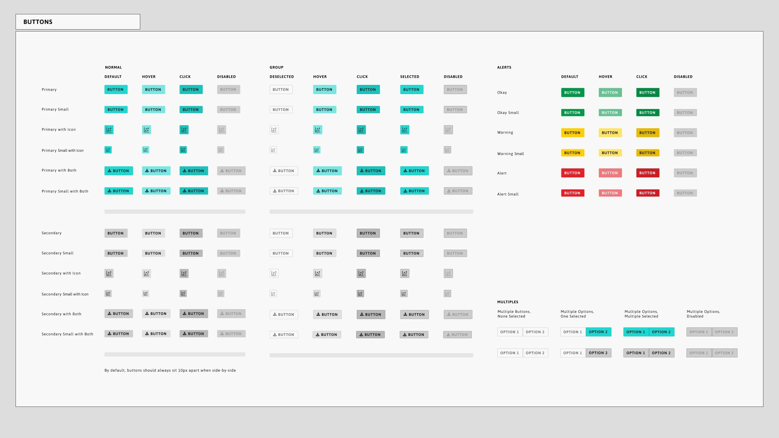
Both designers and developers at Quid were in desperate need of a design system they could leverage in order to maintain a consistent use of a flexible, elegant, and usable UI. Teams were small, so anything that could reduce design or dev time & implementation efforts were of extreme value to Quid. This project, although less glamorous than some of my others, saved time and dollars, eventually allowing us to focus on more difficult tasks and giving users consistent product experiences to alleviate any unnecessary aggravation.
At one point I truly thought this project would be the death of me, but I’m still here so things worked out.
You can browse the open source react library ↗.
My Team:
Oriana Love, Head of Design | Ana Spisak, UX Design | Radhika Sawhney, UX Research
My UX and Data Viz work also had tremendous support from the Data Science, UI, and Visualization developers with whom I worked at Quid.


